




Tandi Jacobs | General Manager | Internal Developers (ID) | mail me |
Colour is deeply embedded in our national identity. It symbolises inclusion, resilience and the power of difference.
South Africa is proudly known as the rainbow nation, reflecting its rich diversity, cultural vibrancy and spirit of unity. This identity appreciates that different colours and combinations carry unique meanings for different people. This essence continues to inspire how we shape the spaces where South Africans live and work.
In workplace design, colour carries similar weight. We believe colour is not merely decorative, it is a strategic instrument. When applied thoughtfully, it influences behaviour, strengthens identity, supports wellbeing and enhances performance. Colour can transform the workplace into a more human, functional and forward-looking environment.
 The strategic role of colour in driving productivity
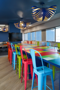 The strategic role of colour in driving productivity
Colour measurably impacts productivity, focus and overall cognitive performance. Scientific and psychological studies support the connection between specific colours and human behaviour.
In the workplace, these principles enhance effectiveness and tailor spaces to their intended use:
- Blues and greens promote calmness and stability. These hues reduce anxiety and sustain focus. They work best in areas that require concentration, such as private offices, quiet work areas or meeting rooms.
- Yellow represents optimism and creativity. It stimulates mental activity and sparks innovative thinking. This makes it suitable for brainstorming zones or creative departments.
- Red energises and draws attention. It increases heart rate and creates urgency. Use it in collaborative zones, transitional spaces, or break areas where movement and interaction are encouraged.
The strategic role of colour in enhancing wellbeing
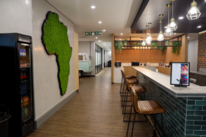 The strategic role of colour in enhancing wellbeing
Well-being plays a vital role in workplace strategy. Colour centrally promotes calm, reduces stress and supports emotional balance.
We draw on biophilic design principles, using nature-inspired palettes to connect employees with the natural world:
- Earthy tones, such as soft greens and warm browns, bring outdoor tranquility into the workspace. These colours support mental clarity and help employees feel grounded and less fatigued.
- Soft neutrals, including warm greys, muted beiges and gentle pastels – create comfort and welcome. They avoid visual overstimulation, especially in reception areas, wellness rooms or informal lounges.
The strategic role of colour in expressing brand identity
Beyond function, colour expresses a company’s identity and culture.
Subtle, sophisticated incorporation of brand colours reinforces corporate values and enhances belonging:
- Technology companies often use cool tones like blue or grey. These colours convey professionalism, trust and technical expertise.
- Creative agencies tend to favour vibrant palettes. These express innovation, dynamism and energy.
- Financial institutions typically rely on muted schemes. These tones evoke reliability, calm and tradition.
- The strategic role of colour in defining function and flow
Colour helps in space planning and wayfinding. Zoning areas through strategic colour use guides employees intuitively.
This makes spaces more legible and easier to navigate:
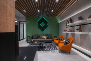 This makes spaces more legible and easier to navigate:
- Darker, muted tones suit quiet zones by creating a focused, introspective atmosphere.
- Brighter, saturated colours work well in collaborative or energetic zones. They encourage movement and interaction.
- Warm colours like reds and oranges encourage conversation and social activity. These are ideal for lounges or communal spaces.
- Cool colours, such as soft blues and greens support emotional regulation and stress reduction. These are suitable for wellness rooms or individual focus zones.
Understanding the interplay between light and colour
Lighting influences colour perception in interior spaces. Therefore, designers must consider lighting during colour selection:
- In north-facing offices with cooler, subdued natural light, warmer tones balance the light. This creates a more welcoming atmosphere.
- In well-lit spaces, saturated or bold colours work well. Abundant ambient light prevents them from overwhelming the senses.
The strategic role of colour in the future of work
Thoughtful use of colour combines psychology, brand alignment, and functional design. As organisations evolve and adopt new work models, colour remains a powerful but underused tool in shaping workplace culture and performance.
A well-designed workspace integrates purpose, people, performance, and place. Intelligent colour use makes this integration possible.